The Best Background Color for LinkedIn Profile Photo Success: A 2026 Guide | BgRemovit
·10 min read·visibility12 views
The Best Background Color for LinkedIn Profile Photo Success: A 2026 Guide
Discover the best background color for LinkedIn profile photo success. Learn why pure white fails, how to match your industry, and the top high-contrast choices.
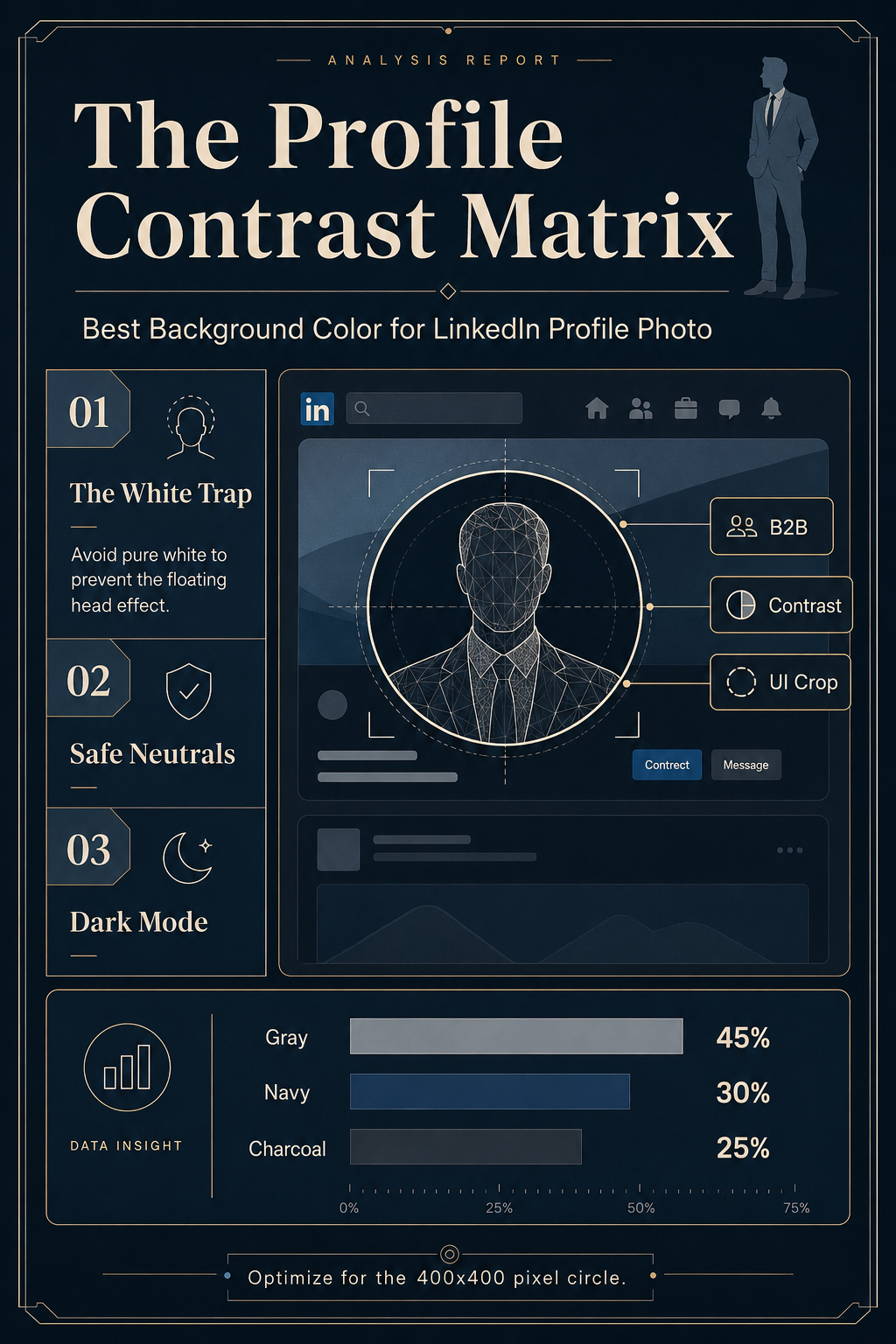
If you want the definitive answer upfront: the best background color for LinkedIn profile photo success is light gray, charcoal, or deep navy blue. Do not use pure white. Pure white blends seamlessly into LinkedIn’s default light-mode interface, erasing the boundary of your circular crop and creating an unprofessional "floating head" effect. Instead, you need a background that provides distinct edge contrast, anchors your silhouette, and communicates your industry's baseline professionalism without distracting from your face.
LinkedIn is not a standard photo gallery; it is a highly structured digital environment with specific user interface (UI) constraints. Your profile picture is compressed into a 400x400 pixel circle, displayed at roughly 48x48 pixels in the feed, and subjected to aggressive JPEG compression. In this environment, subtle gradients get banded, and loud colors scream. Choosing the right background is an exercise in UI optimization as much as it is in personal branding.
Here is the comprehensive, data-backed breakdown of how to select the perfect backdrop for your professional headshot, tailored by industry, wardrobe, and skin tone.
Why Finding the Best Background Color for LinkedIn Profile Photo Matters
Eye-tracking studies consistently show that users scan LinkedIn profiles in an "F-pattern," starting at the top left. Your profile photo is the absolute anchor of this visual hierarchy. It is the first data point a recruiter, prospect, or potential partner uses to gauge your competence, approachability, and attention to detail.
When you upload a headshot, LinkedIn applies a circular CSS mask. If your background color matches the hex code of the surrounding UI (which is #FFFFFF in light mode or #1D2226 in dark mode), that circular mask effectively disappears.
This creates two distinct problems:
The Floating Head Syndrome: Without a visible border, your shoulders and head appear to float aimlessly in the negative space of the user's feed.
Lost Visual Weight: A defined circle acts as a visual target. It draws the eye. When you lose the boundary, you lose the visual weight, making your comments and posts easier to scroll past.
To command attention, you need a background color that creates a crisp, undeniable boundary between your image and the platform's interface.
The "Pure White" Trap: What Not to Do
For decades, corporate photography relied on the pure white seamless paper backdrop. It was clean, clinical, and easy to light. But on modern digital platforms, pure white is a liability.
Beyond blending into the light-mode UI, pure white backgrounds often suffer from "light wrap"—where the bright background illumination spills over the edges of your hair and shoulders, reducing edge contrast. Furthermore, when viewed in LinkedIn's dark mode (which over 40% of mobile users actively use in 2026), a pure white circle acts like a glaring spotlight. It causes eye strain and dominates the screen, shifting focus away from your facial features and onto the blinding white circle itself.
If you must use white, opt for an "off-white" or "warm cream" (#F8F9FA or #F5F5DC). These shades provide enough tonal variance to establish a boundary in light mode while appearing softer and less abrasive in dark mode.
The 4 Best Background Colors for LinkedIn Profile Photos
If pure white is out, what should you use? The most effective LinkedIn backgrounds rely on muted, solid colors or very subtle, blurred gradients. Here are the four top-performing choices.
1. Light Gray / Slate (#E5E7EB to #94A3B8)
Light gray is the undisputed champion of LinkedIn backgrounds. It is universally flattering, completely neutral, and solves every UI problem. It provides a crisp border against LinkedIn’s white background and offers a soft, pleasant contrast against the dark mode interface. Light gray communicates transparency, modernity, and quiet confidence. It is the safest and most effective choice for 90% of professionals.
2. Deep Navy Blue (#1E3A8A)
Navy blue is the psychological color of trust, security, and corporate stability. It is highly recommended for professionals in finance, law, enterprise sales, and executive leadership. Navy provides excellent contrast for lighter skin tones and creates a striking, rich backdrop for light-colored clothing (like a white button-down or light gray blazer).
3. Charcoal / Dark Slate (#334155)
Charcoal is the modern alternative to stark black. It feels sleek, premium, and slightly edgy. This is the go-to color for tech founders, software engineers, and cybersecurity professionals. Charcoal grounds the photo beautifully, making the subject's face pop, especially if the portrait utilizes dramatic, cinematic lighting.
4. Warm Cream / Beige (#F3E8FF or #FFFBEB)
For industries that prioritize approachability, human connection, and creativity—such as HR, therapy, design, and marketing—warm cream or muted beige is excellent. It softens the overall image, making the subject feel accessible and empathetic, while still providing enough contrast to separate from the pure white UI.
Industry Breakdown: Best Background Color for LinkedIn Profile Photo by Sector
Context matters. The color that works for a disruptive SaaS founder might look out of place for a conservative wealth manager. Aligning your background with your industry's subliminal expectations can subtly reinforce your professional narrative.
Finance, Banking, and Law: Stick to Deep Navy or Slate Gray. These colors project fiduciary responsibility and gravitas.
Technology and SaaS: Charcoal, Dark Slate, or even a subtle, blurred office background. Tech favors a sleek, dark-mode aesthetic.
Creative, Marketing, and Design: Warm Cream, muted pastel accents (like a desaturated sage green or dusty rose), or vibrant brand-aligned colors. Creatives have more leeway to use color as a differentiator.
Healthcare and Medicine: Light Gray or Soft Blue. These tones communicate hygiene, calm, and clinical precision without the harshness of pure white.
Human Resources and Coaching: Warm Beige or Soft Peach. Approachability is the primary metric here, and warm tones invite connection.
How to Choose the Best Background Color for LinkedIn Profile Photo Based on Contrast
The secret to a striking profile photo isn't just the background color in isolation; it's the contrast ratio between the background, your wardrobe, and your skin tone.
Wardrobe Contrast
The golden rule is separation. Your clothing must not melt into the background.
If you are wearing a navy suit, do not use a navy background. Opt for light gray or warm cream.
If you are wearing a white blouse, avoid light gray and off-white. Choose charcoal or navy to make the garment pop.
If you are wearing a black turtleneck (the classic tech uniform), a charcoal background might swallow your silhouette. Use light gray to ensure your shoulders are defined.
Skin Tone Contrast
Your face should be the brightest and most distinct element in the frame.
For very pale skin tones, a slightly darker background (like slate or navy) prevents the image from looking washed out.
For deep, dark skin tones, lighter backgrounds (like light gray or warm cream) create beautiful, luminous contrast that highlights facial features.
Medium and olive skin tones generally have the flexibility to use both dark and light backgrounds, provided the wardrobe contrast is dialed in.
The "Squint Test"
To verify your contrast, look at your photo and squint until it becomes blurry. If your head and shoulders disappear into the background, your contrast is too low. If your silhouette remains clearly defined, you have chosen well.
The Technical Route: Using AI to Perfect Your Background
You don't need to book a new studio session just to change your background color. If you already have a well-lit headshot with a good expression but a terrible background (like a messy bedroom, a distracting outdoor scene, or the dreaded pure white), you can fix it digitally.
Modern tools allow you to isolate your silhouette and drop in the perfect hex code in seconds. If you want to experiment with the colors mentioned in this guide without firing up complex photo editing software, you can use a dedicated tool to /image-bg-swap and instantly test out light gray, navy, or charcoal against your current wardrobe. Testing multiple options against your live LinkedIn profile is the best way to see how the color interacts with the platform's UI.
FAQ: Best Background Color for LinkedIn Profile Photo
Can I use a transparent background for my LinkedIn photo?
No. LinkedIn does not support alpha channels (transparency) in profile uploads. If you upload a PNG with a transparent background, LinkedIn will automatically flatten it and fill the transparent areas with pure white or black, often resulting in jagged, pixelated edges. Always upload an image with a solid, baked-in background color.
Are outdoor or "bokeh" backgrounds acceptable?
Yes, provided they are heavily blurred (bokeh effect) and not distracting. A blurred city street or office lobby can add depth. However, ensure the overall color temperature of the blurred background doesn't clash with your clothing. When in doubt, a solid studio color is safer and compresses better on mobile devices.
Should I use my company's brand colors?
Only if your brand colors are muted. If your company color is neon green or bright magenta, using it as a solid background will look aggressive in the feed and distract from your face. If you want to incorporate brand colors, use a neutral background (like light gray) and wear a tie, blouse, or lapel pin in your brand's color instead.
Does LinkedIn's dark mode change which color I should pick?
It reinforces the need to avoid pure white. In dark mode, a white background is glaring. Mid-tones like slate, charcoal, and deep navy look excellent in both light and dark modes, making them the most versatile choices.
The Final Verdict
Your LinkedIn profile picture is a micro-billboard. By treating it with the same UI and UX considerations as a digital product, you ensure that your first impression is professional, intentional, and visually striking. Ditch the pure white seamless paper, evaluate your wardrobe contrast, and choose a background color—whether light gray, charcoal, or navy—that anchors your presence in the feed.
Sources
LinkedIn Design System Guidelines (2025/2026 UI Updates)
Color Psychology in B2B Marketing, Journal of Business Research
Digital Portraiture and Compression Artifacts, Web Design Standards